Our Visuals
Co-branding approach
Our visuals
Our typography
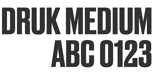
Primary typeface - Druk
Bold, modern and distinctive. Our primary typeface is Druk Medium, used throughout our communications. Its primary use is for headings, to pull out key words and to emphasise a number in facts and statistics.
Druk can be purchased here.
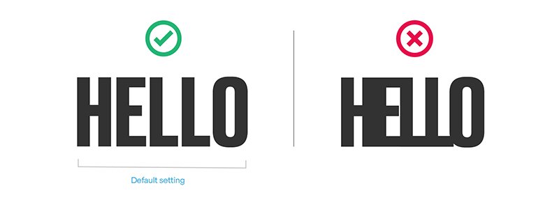
Typesetting for Druk
Kerning: Druk should use – 0 tracking.
Ensure letters do not touch in any headlines.
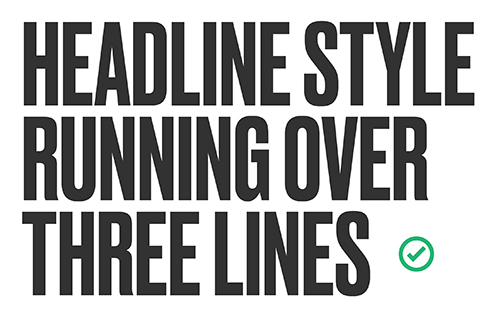
Using Druk for headlines, titles and quotes
We use cap locks in short headlines to feel modern and youthful.
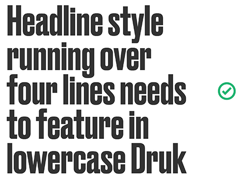
For longer headlines we make the headlines in lowercase.
We never use caps lock for long headlines as this is hard to read.
Using Druk vertically
Druk can only be used vertically for none essential words and short phrases. If it is used the viewer should be able to fully understand the story and/or messaging regardles of whether they can read the vertical text.
Secondary typeface - Steradian
Clean, friendly, and highly legible. Our secondary typeface is Steradian. We use Regular, Light, and Medium to allow us to flex our tone across audiences and channels. Its primary use is for introduction and body text.
On occasions when the brand needs to feel premium, Steradian can be used as a headline typeface.
Steradian can be purchase here.
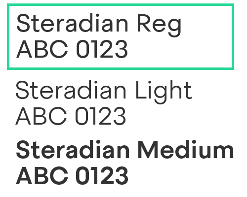
Typesetting for Steradian
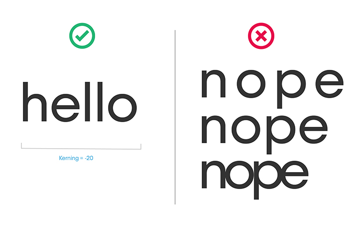
Kerning (space between the letters):
Steradian should use – 20 tracking.
Steradian is tightened to – 20 so that it is easier to read through digital applications.
Leading (space between lines):
Steradian 6pt—24pt: should use +1pt line spacing e.g. 18pt/19pt
Steradian 40pt—72pt: should use -2pt line spacing e.g. 42pt/40pt
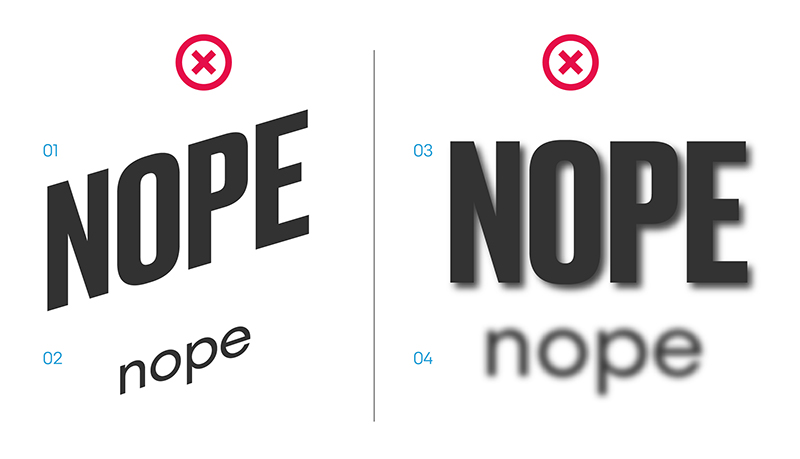
Dont's
We need to make sure that we do not tamper with our typography.
Fig 01 + 02 - Do not slant the typefaces.
Fig 03 + 04 - Do not use any effects on the typefaces.
Type Hierarchy
Here is a simple example of how to use effective type hierarchy.
Headings
Druk Medium
tracking
leading
Uppercase
No hyphenation
Subheadings, standfirsts and quotes
Druk Medium or Steradian Medium
Minimum size: 14pt text
Sentence case
No hyphenation
Body copy
Steradian Light
Minimum size: 12pt text
Sentence case
No hyphenation
Bullet points
Steradian Light or Regular
Minimum size: 12pt text
Either circular or an arrow >
Sentence case
No hyphenation
URL’s, hashtags and calls to actions (CTAs)
Steradian Medium
Sentence case
No hyphenation
Picture captions
Steradian Regular
Minimum size: 9pt text
Sentence case
No hyphenation
Footnotes, small print and sources
Steradian Regular
Minimum size: 8pt text
Sentence case
No hyphenation
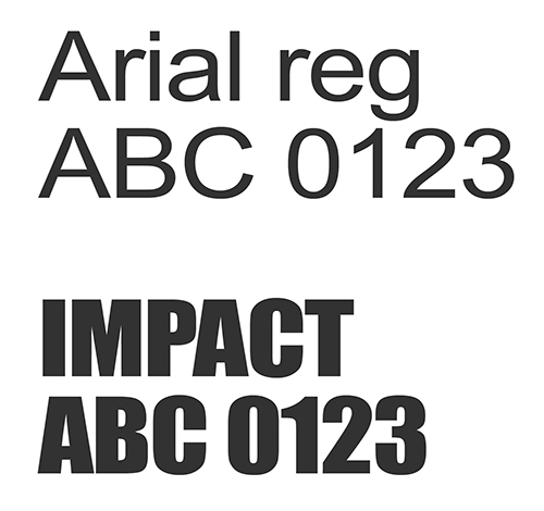
Font substitute
For internal documents and documents created using Microsoft products like PowerPoint, Excel, and Word, you may have to use an alternative font. If you do, this should be Arial instead of Steradian and Impact instead of Druk.
Using our Quotation Marks
Oversized Druk quotation marks can be used at the beginning of quotes. Either above the first word or to the left of the first word. As shown below.
The speech Marks can be found here.


We love hearing your feedback and suggestions for our Brand Guide.
We’ve simplified and updated parts, and we're working on further improvements. If you see something you like or something that isn't working, let us know via this feedback form (Click link) so that we can keep making the guidance better.